Here are the collections of UI / UX design wireframes I have done recently using Sketch, Adobe XD and MaterialDesign Library. Lo-fi wireframe was done using Balsamiq. Whiz - mobile app UI
WHIZ was my first-ever UI/UX design designed via Sketch.
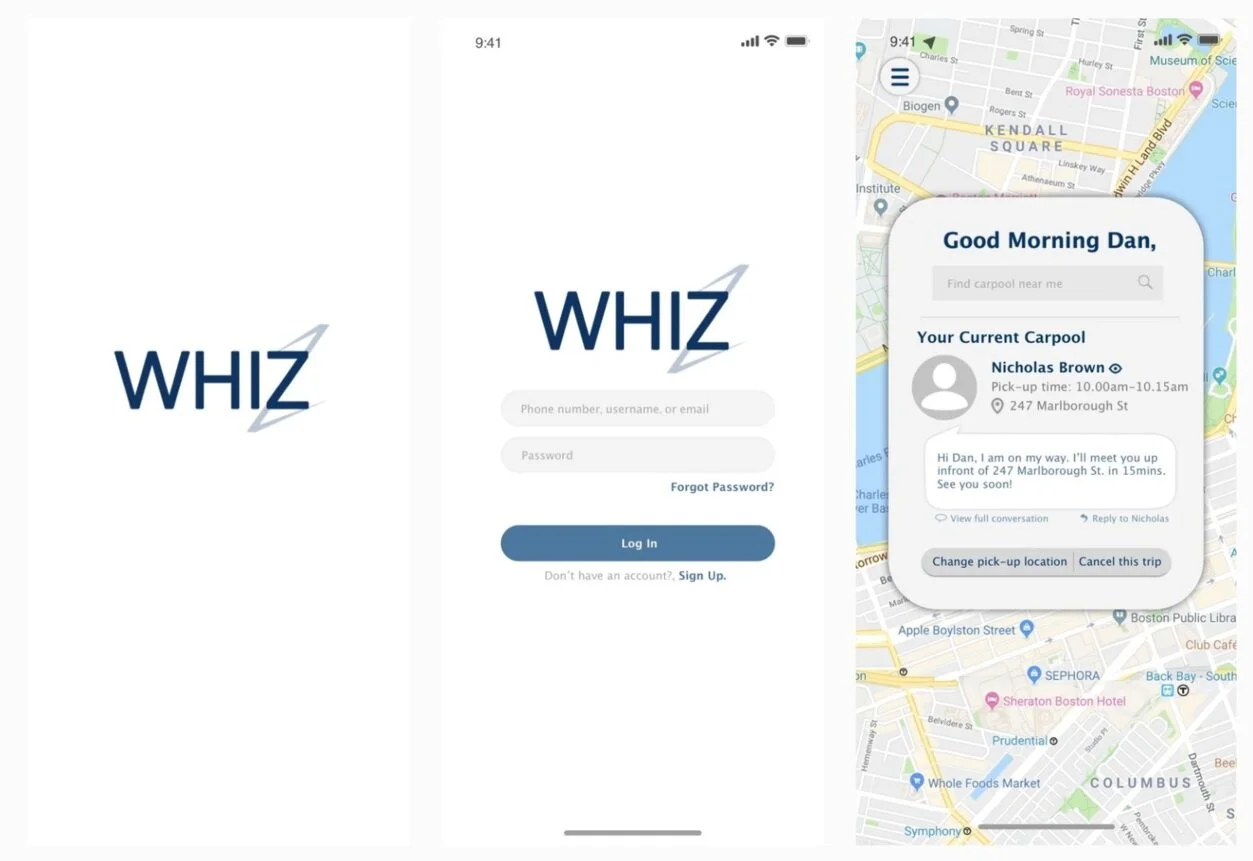
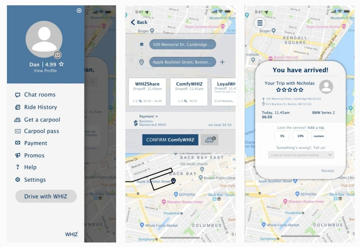
WHIZ is a hi-fi wireframe for mobile application based on me and my boyfriend’s idea of carpooling services. It was my first project on Sketch. I was in the process of learning and trying.
WHIZ Login process and landing page
WHIZ application features
WOLFBERRY - mobile app UI
Wolfberry showcases my design on a start-up project which I am a technical teammate (front-end developer) of. Wolfberry simply is a mobile application which aims to connect traditional Chinese medicine (TCM) doctors and its practitioners. The platform primarily consists of functions such as making an appointment with TCM doctors and viewing TCM herbs and recipe lists online.
Wolfberry focuses on a simple, easy to navigate UI. I use subtle pastel green to represents herbs which are main ingredients in Traditional Chinese Medicine
Wolfberry lo-fi wireframe; onboarding. Designed via Balsamiq.
Wolfberry lo-fi wireframe; booking appointment process
Wolfberry lo-fi wireframe; details pages
Wolfberry hi-fi wireframe; onboarding
Wolfberry hi-fi wireframe; homepage, search providers page, search herbs page
Wolberry hi-fi wireframe workflow
Microsoft CVBP - web UI
UI for Microsoft CVBP is a simple wireframe designed via Adobe XD. I made the design for Cloud Computing class project in which our client/mentor is the collaborator and owner of Microsoft CVBP Github repo. I also worked on the front-end on this with Bootstrap!
The goal of this project is to designed an easy to navigate UI for developers to test their machine learning models
CVBP Home page
CVBP Uploading stages
CVBP Result page and select new classification page
Manatal - WEB UI
I did an internship for Manatal in summer of 2020. Manatal is an AI recruitment software. Manatal has an existing software which was designed to be a web application. However, the UI/UX of the software needed to be redesigned for better user experience and cohesiveness. I worked on redesigning several UI/UX components for web pages via Adobe XD. I am responsible for redesigning new components such as new cards, table, UI workflows, but some of the elements are kept from previous design (left navigation bar, modal, button etc.) as demanded by project manager.
The UI/UX pages I designed include:
Duplicate candidate management system
Notifications
Several loading pages
Onboarding process
Signup / Email Notifications
Administration setup
Career page
Manatal Onboarding — I designed the tutorials part to help first time user learn more about the application features.
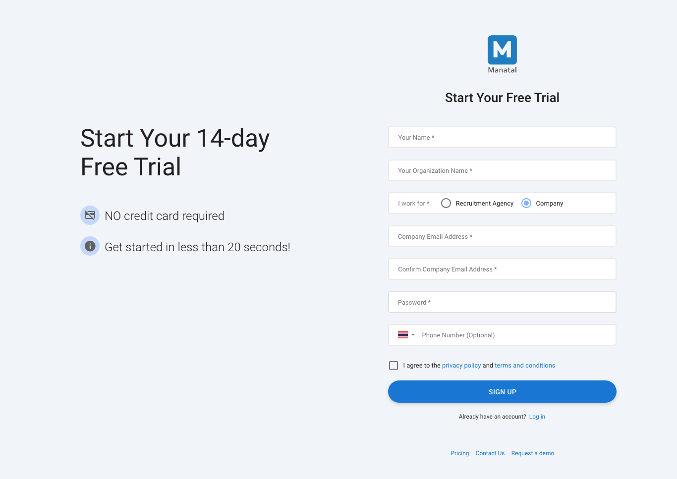
Manatal Sign Up Web UI
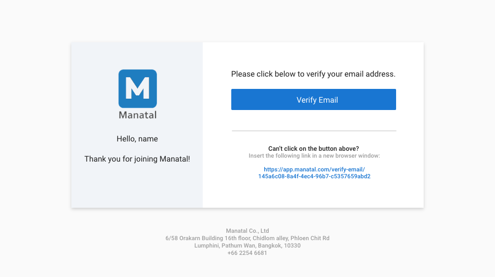
Manatal Email Notification Component — this component will be embedded in an automatic email sent out to newly registered user.
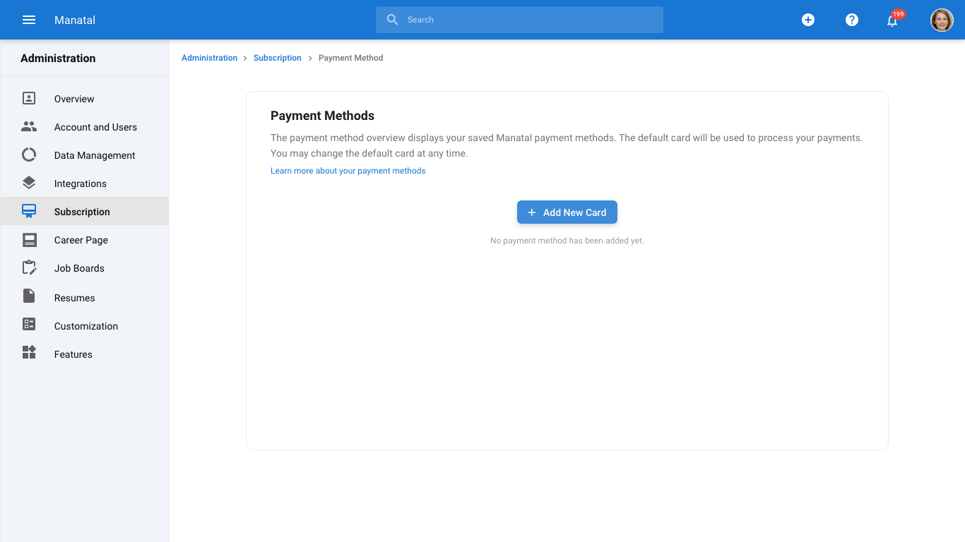
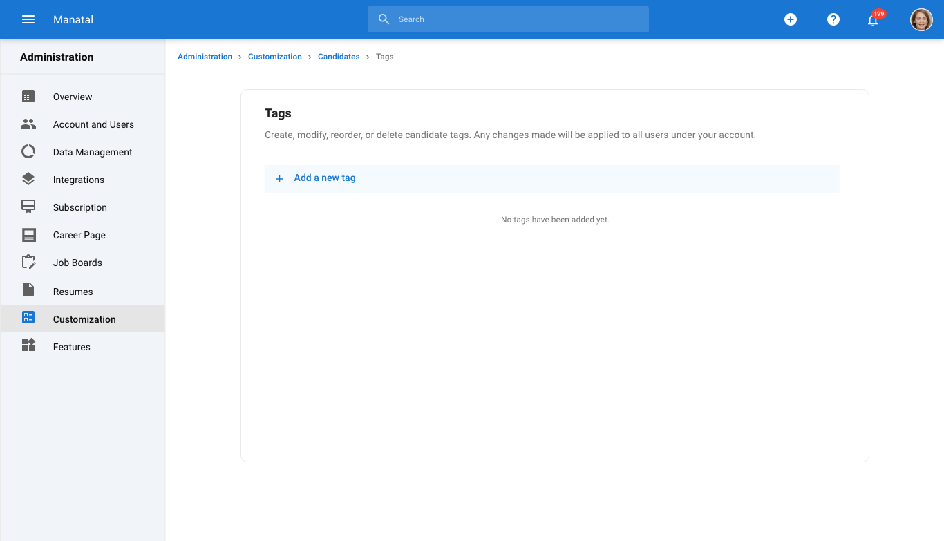
Manatal Administration Page — the administration page helps user set up features within the Manatal application. The sections are divided clearly with specific settings options in each of them.
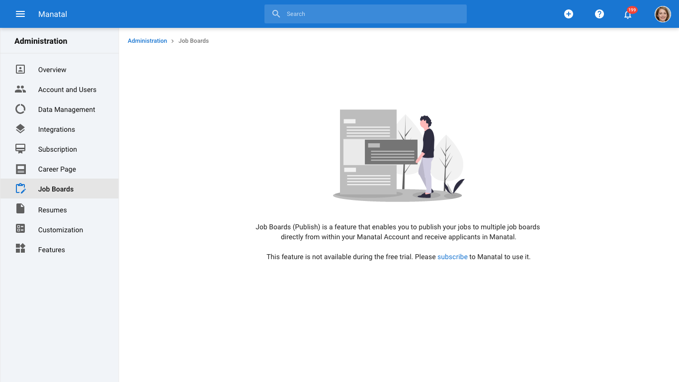
Manatal Administration Trial Software Page — Administration page shown to user with trial software. User can choose to subscribe before trial ends and cancel subscription anytime.
Manatal Administration Page Empty States — design examples for when pages do not contain any user-added elements.
Manatal Career Page — similar to Administration Page in design. Career page helps Manatal users create their own webpage for a more convenient recruitment process.
Manatal Duplicate Management System — I redesigned the complicate duplicate candidate management system with simpler workflow. Using cards and steps navigation, users are forced to follow steps to complete the task. This workflow makes it easier for user to learn and get familiar with the system on their own without the need to consult Manatal support team.
Manatal Notifications Settings — the notifications settings page allow users to set whether they want to receive notifications for completed tasks. There are in-app notifications and email notifications. Users have to enable the main notifications (in-app & email) before they can change specific notifications settings.
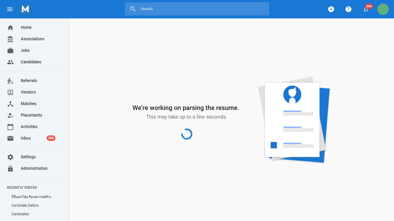
Manatal Loading Pages Design — these pages will show up instead of indicator bar to indicate that the jobs/tasks are being processed while users are waiting.
Imager - mobile App UI
Imager was my senior design project at Boston University. The goal of this project is to create a non-line-of-sight (NLOS) imaging mobile application for iOS. The application would utilize Katie Bouman’s NLOS algorithm from Turning Corners into Cameras to analyze corner image taken on an iPhone camera. The Imager mobile application would help user identify an object behind the corner by just using an iPhone to take an image of penumbra (shadow casted by the wall). For this project I worked on designing as well as front-end and back-end of the iOS mobile application (Development language: Swift).
The design goal of Imager is to have an easy to navigate UI for anyone to test out ‘seeing around the corner’ technology.
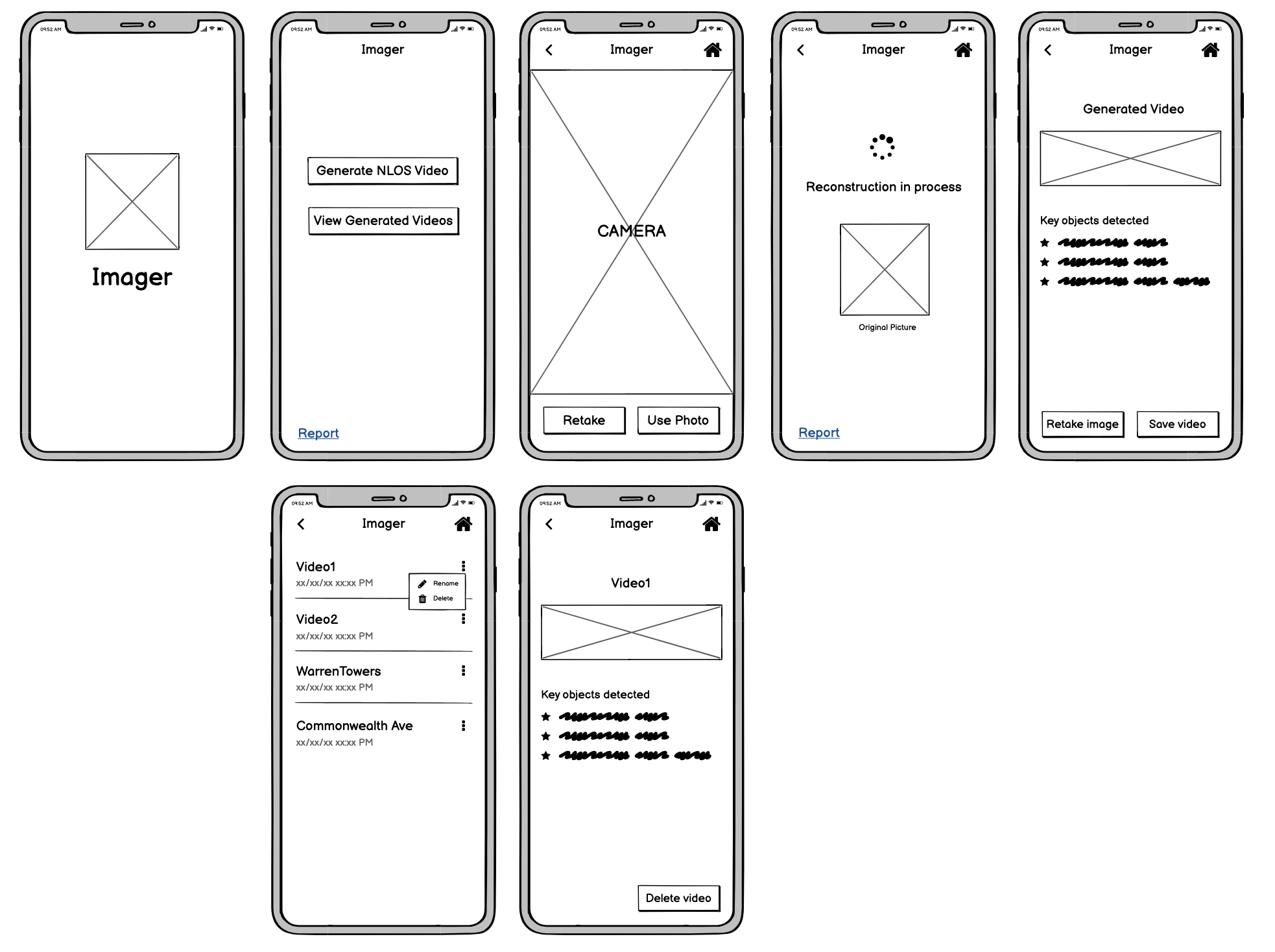
Imager lo-fi wireframe. Designed via Balsamiq.
Imager hi-fi wireframe workflow in 2x speed


